Commons:Photography critiques
| SpBot archives all sections tagged with {{Section resolved|1=~~~~}} after 7 days and sections whose most recent comment is older than 90 days. | |
Graphics community: Graphic Lab · Graphics Village Pump · Picture Requests · Photography Critiques · Photography terms
 Welcome to the Photography critiques!
Would you like a second opinion before nominating a photograph of yours as a Quality Image, Valued Image or Featured Picture candidate, can't decide which of your images to enter into one of the Photo Challenges? Or do you have specific questions about how to improve your photography or just would like some general feedback?
This is the right page to gather other people's opinions!
If you want general suggestions to a good photo, you can ask here, and we already wrote guidelines.
If you don't get some terminology used here, don't be shy you can ask about it, or read
Please insert new entries at the bottom, and comment on oldest entries first.
To prevent archiving use {{subst:DNAU}}, because SpBot archives all sections after 90 days, unless archiving has been postponed or suppressed through the use of {{subst:DNAU}}. You can ask the bot to archive a section earlier by using {{Section resolved|1=~~~~}} – then it will be archived after 7 days.
Palm trees[edit]

Especially if there is someone also using a phone like me, I would really like to get some feedback on settings and tools. It is the only accessible equipment I can have. Hopefully the photo here can be considered decent, does anyone have tips on what to do to make my photos look more natural and get less noise? Try a lower ISO? gugalcrom123: 💬 talk / 🗳️ contribs / 🖼️ uploads 12:39, 15 November 2023 (UTC)
- Hi, For a phone picture, it is quite OK. Unfortunately phone sensors are very small, and can't record any more details. Even basic cameras can make better pictures. Yann (talk) 13:42, 15 November 2023 (UTC)
- I know, not trying to win any contests but to make images of decent educational value. I can't get a camera, sadly. I will try a lower ISO because it might reduce noise. gugalcrom123: 💬 talk / 🗳️ contribs / 🖼️ uploads 13:52, 15 November 2023 (UTC)
- Hi again. I just remastered it, it seems HDR in this case creates more noise and blur. gugalcrom123: 💬 talk / 🗳️ contribs / 🖼️ uploads 15:03, 15 November 2023 (UTC)
Mountain under snow[edit]
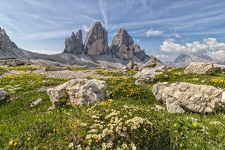
Hi, I submitted these for QI, but they have not been reviewed yet. Is there anything to do to improve them? Thanks, Yann (talk) 16:54, 18 December 2023 (UTC)
.svg/15px-Pictogram_voting_comment_(orange).svg.png) Comment Both photos appear to me to be too heavily denoised and then over-sharpened, so that the rocks in particular show strange structures. Unfortunately, I'm seeing more and more photos at QIC that have been overly smoothed out, probably out of sheer fear that they might be rejected due to image noise that can be detected with a magnifying glass. --Smial (talk) 17:07, 18 December 2023 (UTC)
Comment Both photos appear to me to be too heavily denoised and then over-sharpened, so that the rocks in particular show strange structures. Unfortunately, I'm seeing more and more photos at QIC that have been overly smoothed out, probably out of sheer fear that they might be rejected due to image noise that can be detected with a magnifying glass. --Smial (talk) 17:07, 18 December 2023 (UTC)
- @Smial: There is no modification after taking the pictures. These are taken with a smartphone, so they have technical limitations. Yann (talk) 21:53, 19 December 2023 (UTC)
- Oh, I didn't look at the EXIF. But the problem is obvious, isn't it? --Smial (talk) 00:06, 20 December 2023 (UTC)
- They don't seem much worse than the ones which were promoted. Yann (talk) 13:08, 20 December 2023 (UTC)
- Well, I have the impression that many ratings are quite arbitrary. Personally, I always try to find a balanced decision and justify it as clearly as possible. In the case of image noise, this means that I accept clearly recognizable noise if the circumstances of the subject or the shooting situation obviously require a high ISO setting, but that exactly the same image noise leads to rejection for "easy-to-take" photos. And I find photos that have been so heavily de-noised that surfaces look like Lego plastic or fine structures look somehow artificial quite terrible. I also find the trend on QIC of completely smoothing out the background of high-ISO photos a terrible thing. --Smial (talk) 12:03, 21 December 2023 (UTC) Translated with DeepL.com (free version)

Hi, I like the light and the composition, but it looks noisy. Is it possible to correct that? Yann (talk) 18:45, 24 December 2023 (UTC)
- You may use the GIMP "Unsharp mask" filter in Filters>Enhancement>Unsharp mask. gugalcrom123: 💬 talk / 🗳️ contribs / 🖼️ uploads 16:07, 27 December 2023 (UTC)
- I have uploaded a suggestion, if you don't like it, just reset it. See upload comment. --Smial (talk) 23:11, 27 December 2023 (UTC)
Woodmoor, Maryland[edit]
I've been using my iPhone to take images of places in Silver Spring. Around two months ago, I took this image one of Woodmoor's welcome signs:

I would like some feedback on this. Thanks, Davest3r08 (talk) 19:35, 30 December 2023 (UTC)
- The shadows in the foreground are distracting. Some combination of getting closer to the sign, choosing a different time of day, tighter crop, and/or changing the angle could address this issue. Buidhe (talk) 19:05, 31 December 2023 (UTC)
- In addition to the design flaws already described by Buidhe, the photo shows an inhomogeneous impression of sharpness. Areas with high contrast appear over-sharpened, whereas the algorithm apparently found no edges in the central lettering that it could process. As a result, the letters appear blurrier than the leaves, meadow and everything else around them. --Smial (talk) 11:59, 31 January 2024 (UTC)


